

Recognizing the challenges of using the core CIRA brand mark with colour variations across multiple cyber products, I implemented a distinct approach that allowed each product to stand apart while remaining part of a cohesive suite under the broader CIRA brand.
I revisited the Bauhaus design principles referenced during the creation of the CIRA logo. Exploring communication through simple geometric forms led to a timeless, minimal solution. This abstract approach also provides flexibility to accommodate future products added to the suite.
By leveraging the tertiary colour palette for the cyber products, we achieved a cohesive yet distinctive visual system that differentiated the collection from other core CIRA services.Using blue as the primary cybersecurity colour also resolved a UX challenge associated with red. Red is closely linked to alerts, urgency, and errors, connotations that are less than ideal for a cybersecurity suite of products.
My Role: Creative Direction, Project Management
Agency: Good and Ready
The Brand Launch
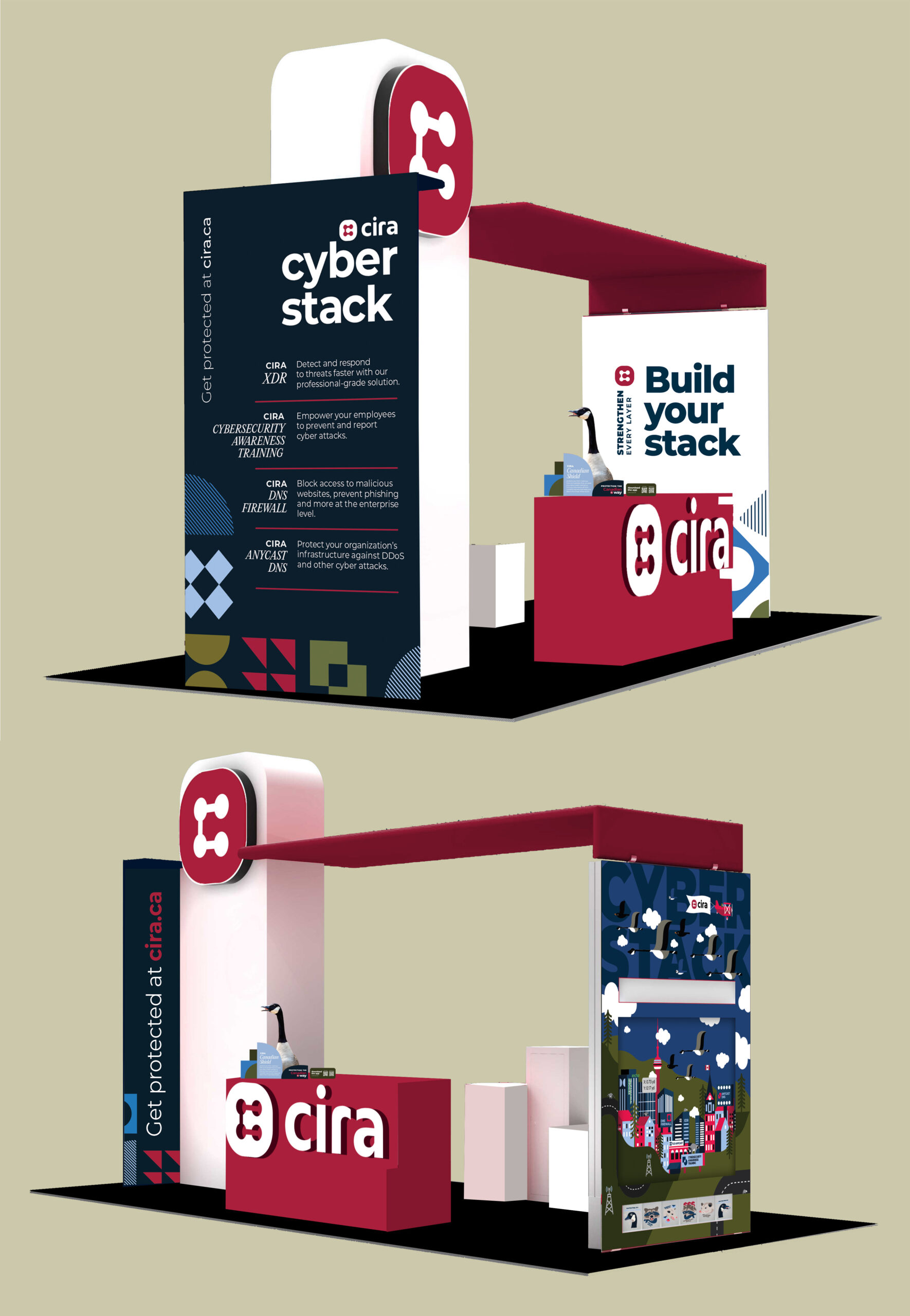
We launched the CIRA Cyber Stack brand publicly at Sector, the largest cybersecurity conference and trade show in North America. Standing out in the trade show environment was critical, as we were competing against many prominent, large-scale brands with complex booth builds. We leaned heavily on creative to let the product shine, using a vibrant and playful design elements closely tied to the product’s brand shapes.
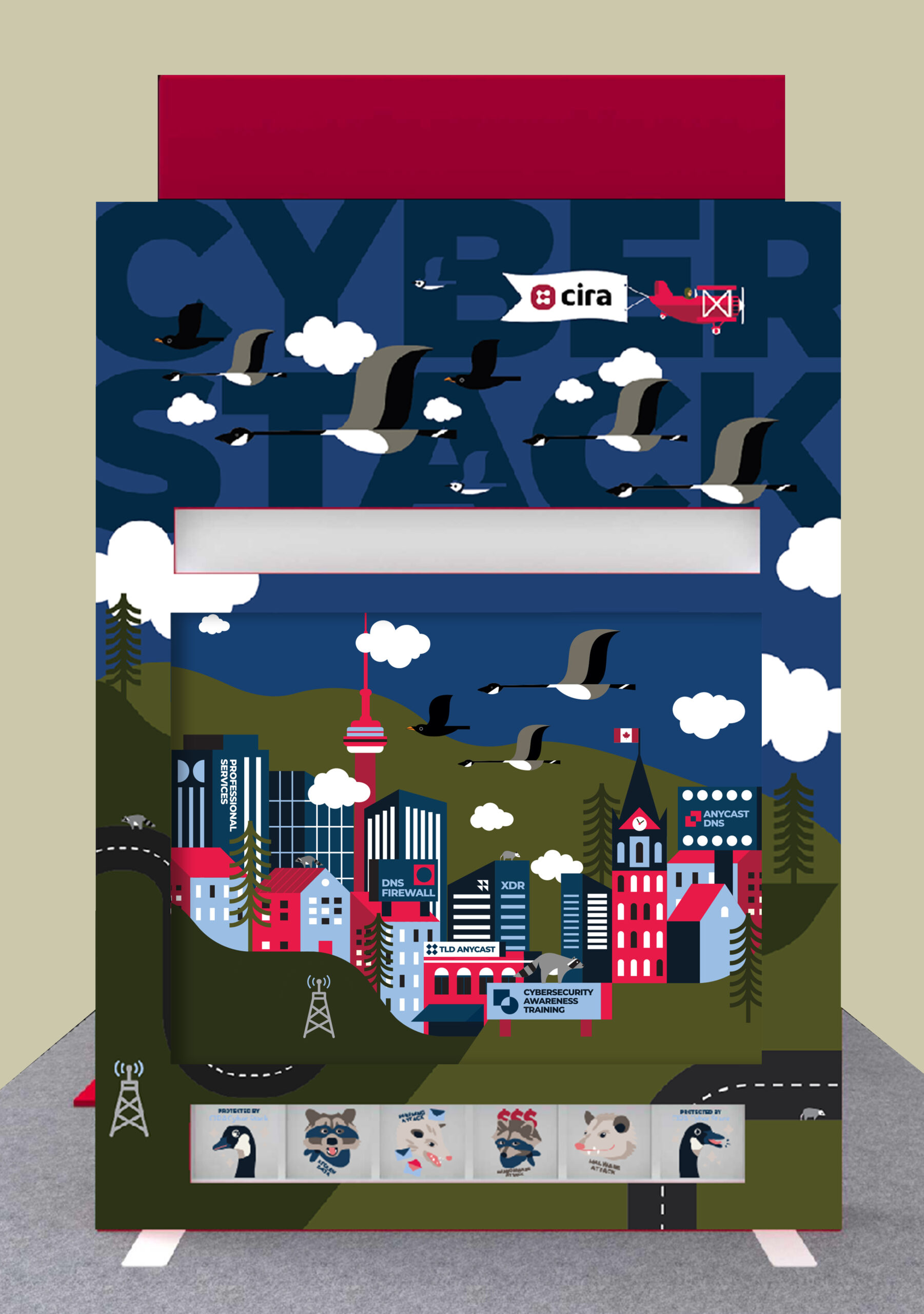
A Plinko board wall served as a highly effective marketing tactic and a major draw to the booth. The visual centrepiece featured a Toronto cityscape populated with raccoons, geese, and opossums, introducing a level of whimsy uncommon among cybersecurity brands. The illustrated animals were directly tied to the characters at the base of the board. If a puck landed in a cyber villain slot, participants received a lower-value prize, while landing in the Cyber Stack goose slot unlocked a high-value reward. It’s safe to say that there was a line down across the room to access our booth.
My Role: Art Direction & Design
Tools: Adobe Illustrator
Swag and Brand Collateral
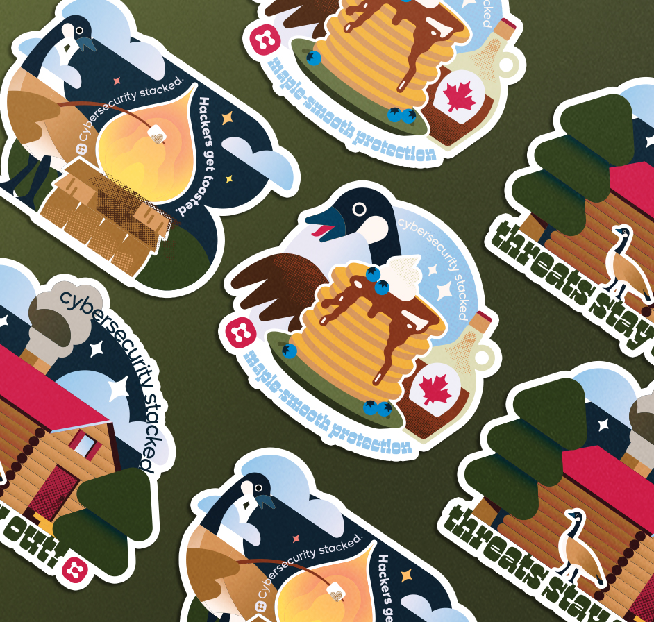
The booth, brand, and swag required close cohesion to remain memorable. Stickers given to participants playing the Plinko game were inspired by the CIRA Cyber Stack goose featured in the game’s visuals, reinforcing the brand experience.
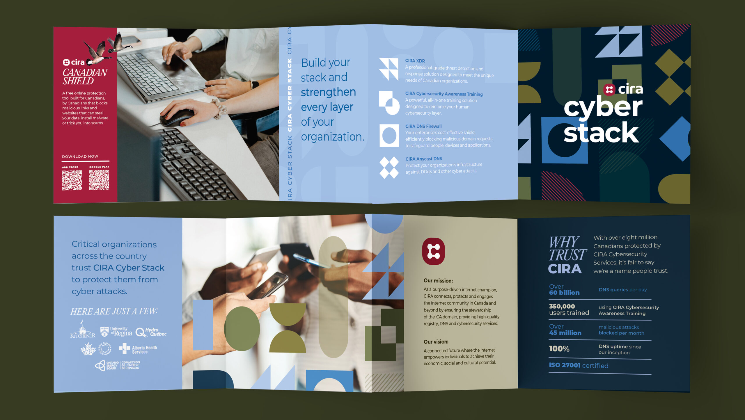
The gatefold card stood out among the stack of papers collected at other booths due to its size and dynamic format. It provided a quick, compact way to introduce CIRA Cyber Stack and direct the audience to learn more on our website.
My Role: Art Direction & Design
Tools: Adobe Illustrator
Sticker Illustrator: Katrin Emergy