
Three years ago, I led CIRA on a comprehensive rebranding initiative, to bring the CIRA brand to the forefront through a branded house architecture. By closely linking CIRA to each of its products we would increase CIRA’s brand awareness and bolster the reputation of the CIRA brand.
The logo, featuring a connected ‘c,’ was conceptualized as a representation of the interconnections facilitated by the internet. Emphasizing the Canadiana red as our primary brand colour was non-negotiable in defining our brand identity. To provide creative flexibility, the secondary and tertiary palettes were intentionally muted, offering versatility in our brand creative. Rigorous testing of the colour palette was conducted to ensure compliance with accessibility standards.
My Role: Project Lead, Art Direction of Creative Collateral & Execution
Tools: Adobe Indesign, Adobe Illustrator, Adobe Photoshop
Brand Design Agency: Giants and Gentlemen
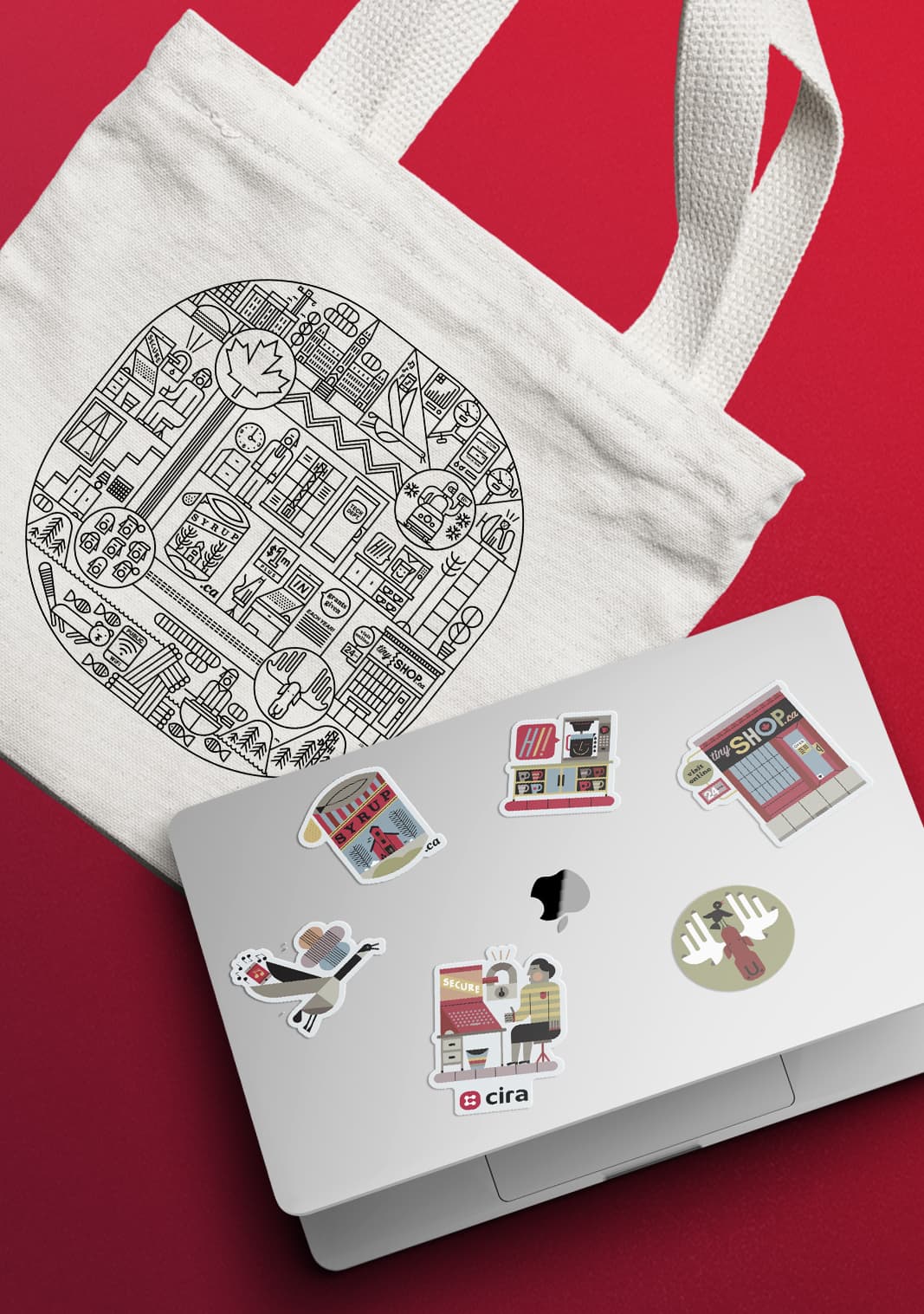
Membership Swag
We collaborated with Canadian illustrator Raymond Biesinger to craft an exclusive CIRA member-only tote bag and sticker sheet. New members received the sticker sheet by mail, while the tote bags were distributed at quarterly member events across Canada.
The visual concept behind the tote aimed to depict the inner workings of CIRA, featuring numerous Easter eggs within the intricacies of the illustration. The sticker sheet drew inspiration from the larger tote illustration, highlighting select favourite moments and accentuating them with the CIRA tertiary colour palette.
My Role: Creative Direction
Illustrations By: Raymond Biesinger